Tree views
A Tree View is a visual control useful for displaying information in a hierarchical organization. It consists of a list of objects. These objects can be comprised of other objects, which in turn can be comprised of other objects, and so on. A user navigates through the lists by expanding and collapsing objects to view and to hide their component objects.
There are a number of attributes you can set to control the behavior of a tree view. You can define the default bitmaps for selected and non-selected objects. You can set the level of indentation for the display of an object's component objects. You can specify to have lines from an object to its component objects or lines to the root object shown or not shown.
Let's continue expanding our example part, this time by adding a Tree View part to display a hierarchy of Smalltalk classes.
1. In the Composition Editor, select the Tree View tab to cause its page to come to the front.
2. Add a Tree View part, change its name to Tree View and attach its four sides to its parents four sides. This will cause it to resize as its parent is resized.
3. Open the tree view's settings and set the showRootLines property to true.
Next, add a Variable to the free-form surface and change its name to Root of Tree.
Now, write a two scripts to populate the tree view. Switch to the script editor and define the following methods:
initializeTree
| root |
root := Collection.
(self subpartNamed: 'Root of Tree') value: root.
(self subpartNamed: 'Tree View') add: root.
self initializeSubtree: root.
initializeSubtree: parentClass
(parentClass subclasses asSortedCollection: [:a :b |
a name <= b name])
do: [:class |
(self subpartNamed: 'Tree View')
add: class
parent: parentClass.
self initializeSubtree: class]
initializeTree defines the root of the class hierarchy we will be displaying, the Collection class, adds it to the tree view, and invokes initializeSubTree to populate the tree view with subclasses of Collection.
initializeSubTree is then called recursively to add all subclasses of Collection.
Return to the Composition Editor and connect the openedWidget event of the tree view to the initializeTree script. Then, add icons to the tree view to improve its appearance. An icon will appear just before each text entry in the tree view. Open the settings of the tree view and set the defaultGraphicsDescriptor property to be the icon at index 45 of abtico40.dll.
The part should now look like this:

Test the part. Try clicking on the + and - symbols to expand and collapse the subclasses of a class. It should look like this:
So far, we have simply added objects to the tree view; these objects have no special behavior. Tree views display these objects but don't interact with them in any special way, because the objects don't implement behaviors a tree view can expect. When using a tree view part in this manner, the behavior and appearance of all of the entries in the tree view are the same and determined by the tree view's settings. For example, all of the icons are the same and all entries have +, -, or no symbols.
However, it is possible to have different behaviors for different types of objects in the tree view or a different behavior for each object. You do this by adding an object to a tree view that defines the message abtCwTreeNode to return an instance of AbtCwTree node. An AbtCwTreeNode defines things such as default icons, icons for when an object is selected, and menus. It also determines whether to show + or -. This means that by adding objects that define abtCwTreeNode, you can customize the behavior and appearance of each object in the tree view independently.
Let's continue our example to illustrate this. We're going to enhance what we've done to show the AbtPart class hierarchy with each entry having its VA Smalltalk defined icon.
First, we need to define a class that will implement abtCwTreeNode and have instance variables to refer to an AbtCwTreeNode and the subject class. From the Organizer, create a new Smalltalk class called ClassTreeNode, which will inherit from Object.
In the Smalltalk Class Browser, change the class definition to the following:
Object subclass: #ClassTreeNode
instanceVariableNames: 'class abtCwTreeNode '
classVariableNames: ''
poolDictionaries: ''
Now add a class method so we can create instances of ClassTreeNode:
for: aClass
^(super new class: aClass) initialize
Next, add the following instance methods:
abtCwTreeNode
abtCwTreeNode isNil
ifTrue: [abtCwTreeNode := AbtCwTreeNode newPart].
^abtCwTreeNode
class
^class
class: aClass
class := aClass
initialize
self abtCwTreeNode graphicsDescriptor: self class abtInstanceGraphicsDescriptor
printString
^self class name asString
abtCwTreeNode returns the AbtCwTreeNode for a ClassTreeNode and uses lazy initialization to set the value on the first reference. initialize is invoked when a ClassTreeNode is created and sets the graphicsDescriptor attribute of the AbtCwTreeNode to be a VA Smalltalk graphics descriptor representing the VA Smalltalk part through the abtInstanceGraphicsDescriptor method. We defined printString so that the text labels associated with each object in the tree view will be the class name. We did not do this previously because Classes already have this behavior defined.
Finally, modify the methods that populate the tree view:
initializeTree
| root |
root := ClassTreeNode for: AbtPart.
(self subpartNamed: 'Root of Tree') value: root.
(self subpartNamed: 'Tree View') add: root.
self initializeSubtree: root
initializeSubtree: parentClassTreeNode
(parentClassTreeNode class subclasses
asSortedCollection: [:a :b | a name <= b name])
do: [:class |
|newParentClassTreeNode|
(self subpartNamed: 'Tree View')
add: (newParentClassTreeNode := ClassTreeNode for: class)
parent: parentClassTreeNode.
self initializeSubtree: newParentClassTreeNode]
As you can see, we are now adding instances of ClassTreeNode to the tree view instead of the actual classes. The instances of ClassTreeView contain references to the classes they represent as well as implement behavior that enables the display of unique icons for each class in the tree view. We've also changed the root class from Collection to AbtPart.
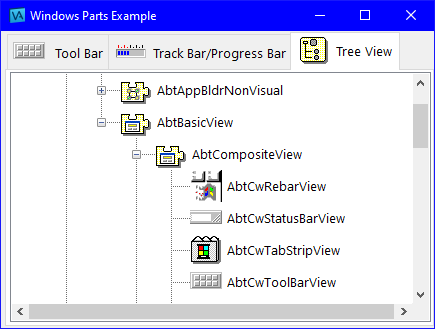
Test the example part again. Expand some of the entries. It should look like this:


Note how the icons for the different classes are different, for the most part, and correspond to the icons you see in VA Smalltalk, for example, on the tool palette in the Composition Editor.
In addition to what we've seen, AbtCwTree nodes also allow you to specify menus for each entry in the tree view. This is useful for defining context menus specific to each object or each different type of object. You would then use the clicked event of the menu buttons to invoke the selected action on the selected object.
Finally, tree views implement a number of other actions to allow you to add and delete objects, rearrange them, expand and collapse them, and retrieve an objects component obejcts, after the tree view is displayed. For information on these other actions, and the Windows controls in general, refer to the Visual Programming User Reference.
Last modified date: 11/02/2021