Slider widget
The slider widget (EwSlider) displays an analog representation of a value within a specified range of values. The range is represented by a horizontal or vertical shaft. The currentValue resource reflects the position of a slider arm that can be moved along the length of the shaft to display the current value.
The orientation of the slider can be specified using the orientation resource. A value of XmVERTICAL indicates that the slider will be drawn vertically, with the minimum value at the bottom and the maximum value at the top. Similarly, XmHORIZONTAL indicates that the slider will be drawn horizontally, with the minimum value at the left and the maximum value at the right. Following are horizontal (on the left) and vertical (on the right) slider widgets:


The slider widget can display one or two scales along the shaft, which can be displayed above and below a horizontal slider, or to the left and right of a vertical slider. Both scales provide a minimum value, a maximum value, and a resolution. The resolution represents the size of the increments between the minimum and maximum values. For example, using a minimum of 0, a maximum of 100, and a resolution of 10 would result in valid values of 0, 10, 20...100. Minimum value, maximum value, and resolution for each scale are set using the topOrLeftScaleMin, topOrLeftScaleMax, topOrLeftScaleResolution, bottomOrRightScaleMin, bottomOrRightScaleMax, bottomOrRightScaleResolution resources.
The methods addDetentToScale:at:label: and addTickToScale:at:label: can be used to add detents and tick marks to a scale. Detents are small images that represent a particular location on the slider scale. They can be clicked to position the slider value to the detent's location. A tick is a mark that can be used to label a particular location on the shaft.
Several resources control the visual appearance of the slider. The thickness of the slider shaft can be controlled using the thickness resource. The buttonStyle resource provides the option of increment and decrement buttons on the shaft. If requested, these buttons can be positioned together at either end of the shaft, or separately, one at each end of the shaft. Further refinements to the shaft position within the slider widget can be made using the verticalMargin and horizontalMargin resources.
The slider value is changed by moving the slider arm with the mouse, depressing the increment or decrement buttons, using the arrow keys, or clicking on a detent. The slider arm moves in units specified by the resolution of the scale. If two scales are displayed on a slider, the resolution depends on the setting of the activeScale resource.
A slider can be used as a progress bar by setting the readOnly and ribbonStrip resources to true and setting the currentValue resource to show the progress.
Slider widgets provide two callbacks to alert applications to changes in the value of the slider. The dragCallback notifies applications of the movement of the slider arm. The valueChangedCallback notifies applications when the value has been changed, that is, after a drag is complete, or if the buttons or detents are used to change the value.
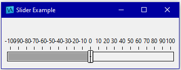
The following method creates a horizontal slider with tick marks along the top scale. Add this method to a class using the pool dictionaries CwConstants and EwConstants.
sliderExample
| slider shell |
shell := CwTopLevelShell
createApplicationShell: 'shell'
argBlock: [:w | w
title: 'Slider Example';
width: 350;
height: 100].
"Create a horizontal slider. The top scale ranges from -100 to 100.
The scrolling buttons appears split (one button on each end of the
slider)."
slider := shell
createSlider: 'slider'
argBlock: [:w | w
orientation: XmHORIZONTAL;
activeScale: XmBOTTOMRIGHT;
topOrLeftScaleMin: -100;
topOrLeftScaleMax: 100;
topOrLeftScaleResolution: 5;
ribbonStrip: true].
"Add tick marks to the top scale".
-100 to: 100 by: 10 do: [:value |
slider
addTickToScale: XmBOTTOMRIGHT at: value size: 5
label: value printString].
slider manageChild.
shell realizeWidget.
When you run the method by evaluating <class name> new sliderExample, you get the following:

Last modified date: 08/22/2024