Tool bars and buttons
A Tool Bar is a collection of buttons, Tool Buttons, which is typically used to provide quick access to an application's frequently used commands and functions. Tool Buttons can be labeled with text, images, or both. In addition to Tool Buttons, there are Tool Separator Buttons which provide extra space between Tool Buttons and allow for logical grouping.
Tool Buttons have slightly different behavior from Push Buttons in that they cannot be resized and that they will always orient themselves to the upper-left position in the Tool Bar. Separator Buttons can be resized to define extra space between Tool Buttons or to include other visual parts such as Text parts and Radio Buttons.
Continuing with our example, we're going to implement a simple to-do list and use a Tool Bar for the to-do list's main functions and to display some information to the user of the example part.
1. In the Composition Editor open on WinPartsExample, click on the Tool Bar tab to cause this page to come to the front.
2. Drop a Tool Bar part at the top of the Tool Bar page. Size it to occupy most of the width of the Tab page and center it.
3. Add three Tool Buttons to the Tool Bar. Label the first, Add; the second, Delete; and the third, Clear List. Add will add an item to the to-do list, Delete will remove an item, and Clear List will remove all the items.
4. Add three Tool Separator Buttons; one between the Delete and Clear List Tool Buttons, and two after the Clear List Tool Button. Size the last Tool Separator Button to the end of the Tool Bar.
5. Add a Text part to the free-form surface of the Composition Editor to the right of the window. Resize the Text part so it will fit within the last Tool Separator Button. Connect its self attribute to the view attribute of the Tool Separator Button you just resized. In the Text part, the user of our part will see the selected item in the list, or the new item typed in.
6. Add a List part at the bottom of the Tool Bar page. Leave a little room at the bottom of the page for the addition of a Status Bar as we continue our example in the next section. The List part will contain the items in the to-do list.
7. Add a Text part just above the List part.
8. Add an Ordered Collection to the free-form surface to the right of the window.
After you add these parts, make some connections:
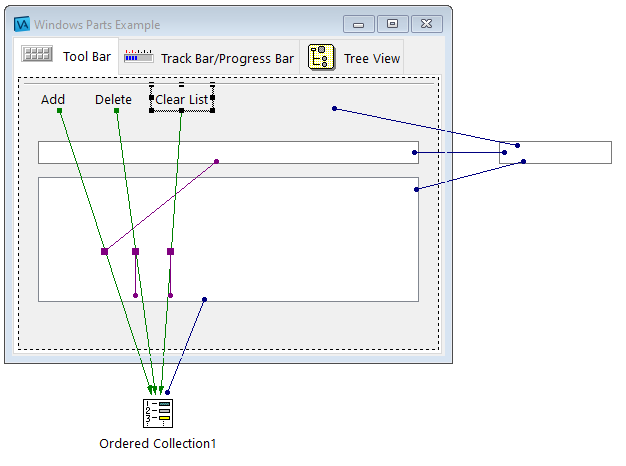
• Connect the object attribute of the Text part on the Tool Bar page to the object attribute of Text part on the free-form surface.
• Connect the selectedItem attribute of the List part to the object attribute of the Text part on the free-form surface.
• Connect the self attribute of the Ordered Collection to the items attribute of the List part.
• Connect the clicked event of the Add Tool Button to the add: action of the Ordered Collection.
• Connect the object attribute of the Text pane on the page to the anObject attribute of the clicked-add: connection.
• Connect the clicked event of the Delete Tool Button to the remove: action of the Ordered Collection.
• Connect the selectedItem attribute of the List to the anObject attribute of the clicked-remove: connection.
• Connect the clicked event of the Clear List Tool Button to the removeAll: action of the Ordered Collection.
• Connect the items attribute of the List part to the aCollection attribute of the clicked-removeAll: connection.
Your part should now look something like this.


Test it and try adding and deleting items in the list and clearing the list. Watch what is displayed in the Text part on the Tool Bar as you enter text into the Text pane on the Tool Bar page or select items in the List part.
You can also add an icon to a Tool Button label instead of, or along with, a text label. To do so, you would set the graphicsDescriptor property of a tool button like we did for a tab in the previous section.
Like tabs, tool buttons can also have text assists. Let's add some to our part.
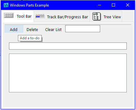
Open the settings of the tool bar and ensure that the showTips property is set to true. Then, open the settings of each tool button and set the toolTipText property to the appropriate text strings. For this example, you might add Add a to-do, Remove a to-do, and Clear all to-dos.
Test the part again. Move your mouse over the tool buttons and pause it on each one to see the text assists. It should look something like this:

In addition to behaving like push buttons, tool buttons can behave like toggle buttons (check boxes) or radio buttons. To get this behavior, change a tool button's buttonType property to XmCHECKBUTTON or XmRADIOBUTTON, respectively. A click on a push button configured as a toggle button causes it to remain selected. A second click causes it to toggle back to its unselected state. If you configure a series of tool buttons that are next to each other as radio buttons, when a user of the part clicks through these buttons, only the most recently clicked button becomes selected. The previously clicked button becomes unselected.
In this section we used a tool bar, tool buttons, and separator buttons to implement a simple to-do list. We used the tool buttons to give a user of our part access to the most frequently used functions.
Last modified date: 11/02/2021