The Common Widgets subsystem allows applications to create static text labels (CwLabel) and several types of buttons:
|
•
|
Push buttons (CwPushButton)
|
|
•
|
Cascade buttons (CwCascadeButton)
|
|
•
|
On/off toggle buttons (CwToggleButton)
|
|
•
|
Application-drawn buttons (CwDrawnButton)
|
Buttons and labels can display either strings, pixmaps or icons as their contents, depending on the value of the labelType resource. See "Icon and pixmap label and button widgets" for more detail on labelType.
The following resources define the visual appearance of labels and buttons: x, y, height, width, marginTop, marginBottom, marginHeight, marginWidth, marginLeft, and marginRight. These are illustrated in the following figure:
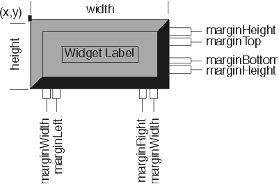
The marginTop, marginBottom, marginRight, and marginLeft resources are typically controlled by subclasses of CwLabel or by the label's parent. For example, a CwToggleButton could increase marginRight to make space for the toggle indicator. The marginHeight and marginWidth resources are usually left alone by subclasses, and can be manipulated by the application if desired.
By default, the name given in a label or button creation message is used as the widget's labelString. The contents of a label or button widget are changed using the labelString: resource method.
CwLabel provides accelerator and acceleratorText resources for adding an accelerator key to a toggle button or push button that is in a pop-up or pull-down menu. An accelerator key will activate a button at any time, provided the parent menu is managed. The accelerator resource is set to an instance of CwAccelerator created using the mask:keysym: class method, which takes the following arguments:
The modifier key mask, which consists of a logical-OR of zero or more of the following: Mod1Mask, ControlMask, or ShiftMask.
The unmodified key, which must be a lowercase letter or special key, represented by a CwConstants 'XK' keysym value.
The acceleratorText resource describes the string that is displayed beside the button in the menu.